Burbank Community Federal Credit Union, a 70 year-old credit union, was facing several issues leading to a rebrand. An almost identical name of a competitor on the same street had created a lot of confusion for years. The credit union had also recently replaced aging facilities with a new modern architectural building. These two factors and the banking climate led the marketing team to push for a new name. However, the conservative board, comprised of long-standing members, was not convinced that a new name would succeed. Previous attempts to change the name had failed.
A formal brand strategy project was recommended in order to align the various stakeholder groups. Management, employee and member interviews were completed to understand stakeholder perceptions and what existing name equity there might be. The research uncovered an overwhelmingly strong loyalty to the credit union and a culture that was personable, engaging and unique.
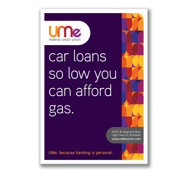
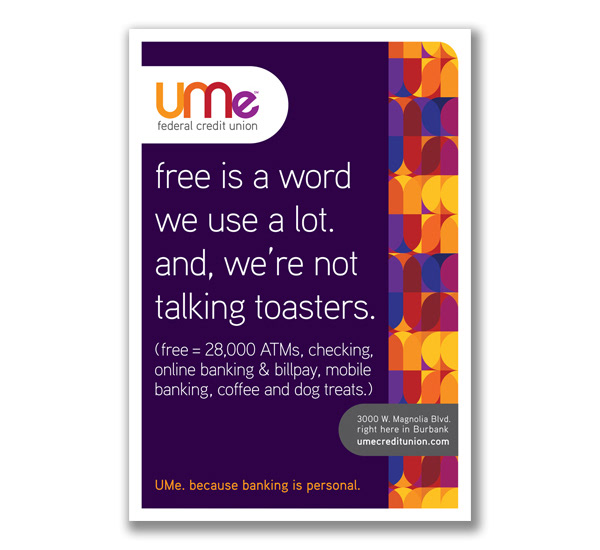
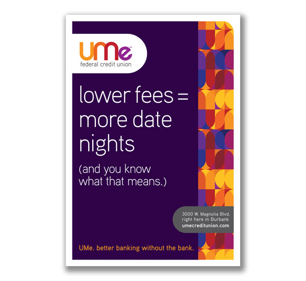
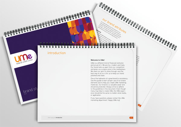
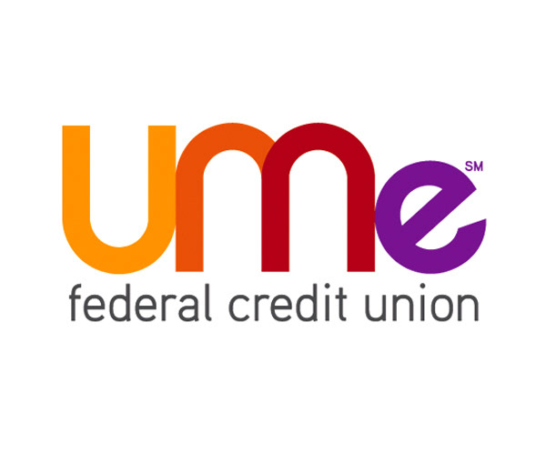
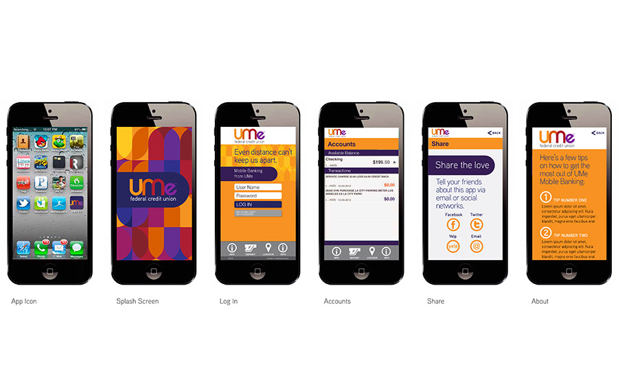
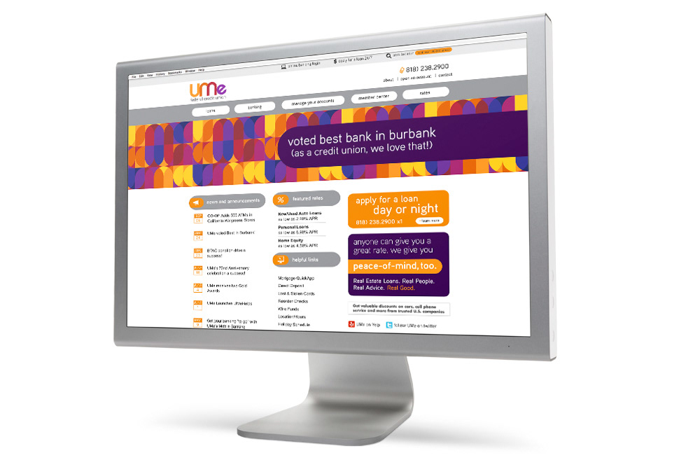
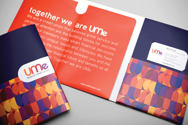
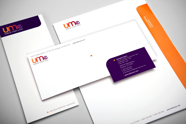
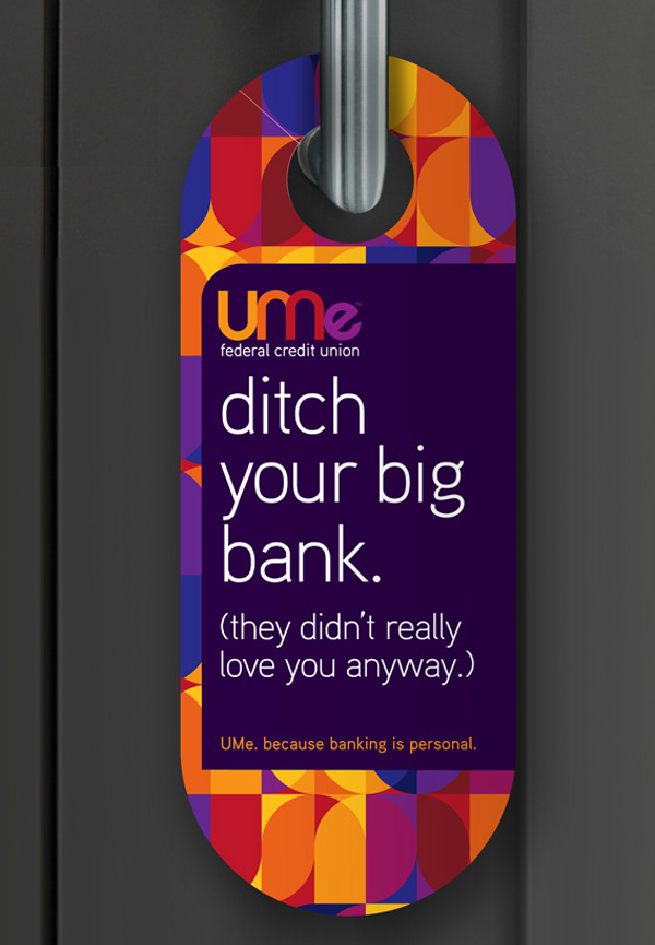
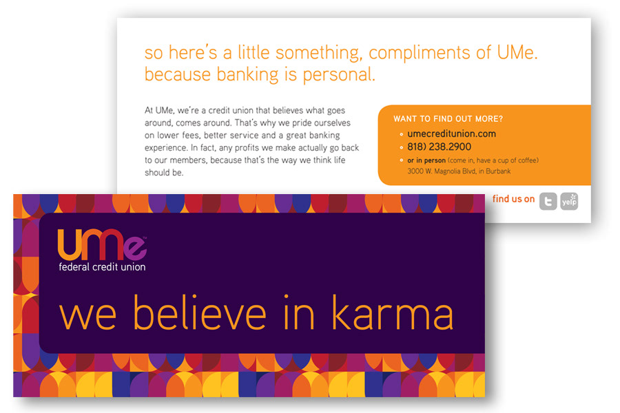
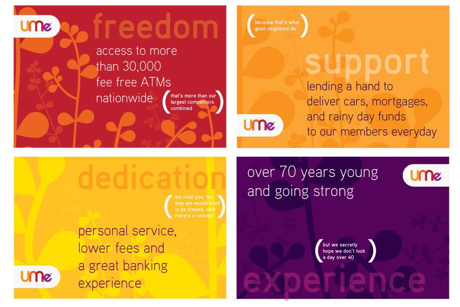
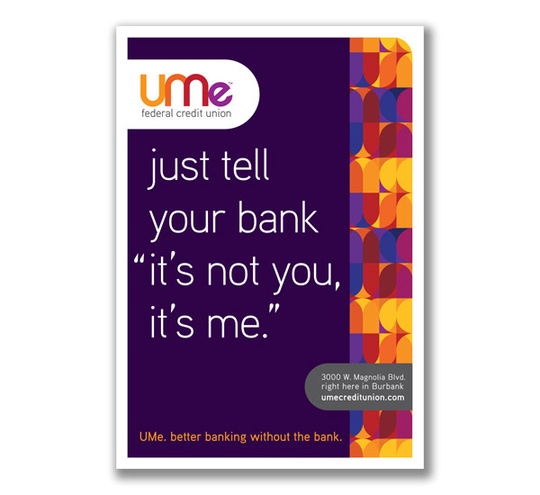
The name “UMe” was chosen for its direct illustration of the member/credit union relationship, it’s personality, and its modern alternative name structure. The graphic identity continues the idea of connection with a bright, blended color palette and a secondary pattern created from the adjoining forms found in the logo.
The result is a revitalized internal culture and an identity that directly expresses the priorities of the credit union. Steady growth in the months post-launch has shown an approximate 30% increase in new accounts. The credit union now has a unique story to tell that separates it from its competition, and a renewed culture that paves the way for increased growth in the years to come.
A formal brand strategy project was recommended in order to align the various stakeholder groups. Management, employee and member interviews were completed to understand stakeholder perceptions and what existing name equity there might be. The research uncovered an overwhelmingly strong loyalty to the credit union and a culture that was personable, engaging and unique.
The name “UMe” was chosen for its direct illustration of the member/credit union relationship, it’s personality, and its modern alternative name structure. The graphic identity continues the idea of connection with a bright, blended color palette and a secondary pattern created from the adjoining forms found in the logo.
The result is a revitalized internal culture and an identity that directly expresses the priorities of the credit union. Steady growth in the months post-launch has shown an approximate 30% increase in new accounts. The credit union now has a unique story to tell that separates it from its competition, and a renewed culture that paves the way for increased growth in the years to come.


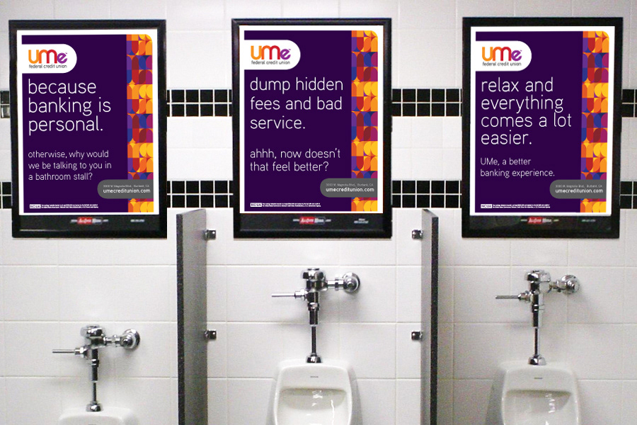
Bathroom stall advertising

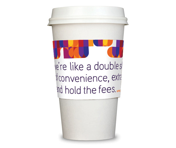
"We're like a double shot of convenience, extra service, hold the fees."
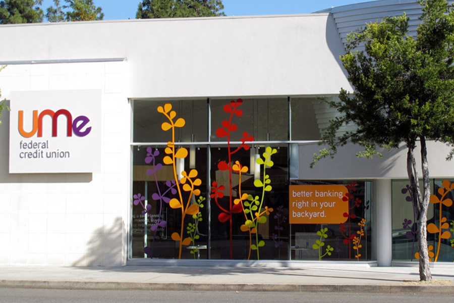
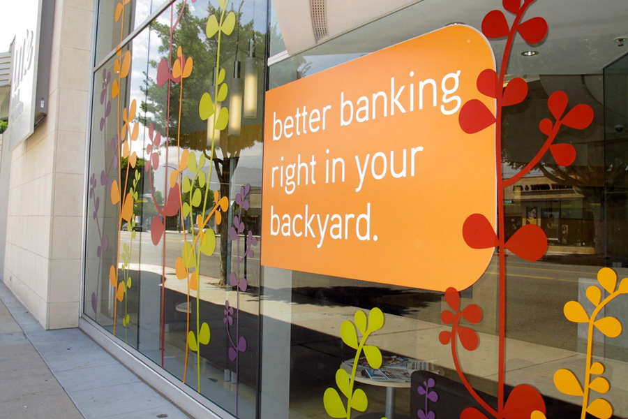
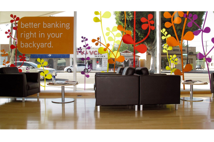
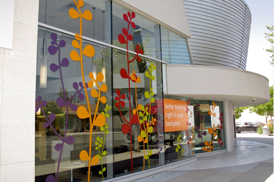
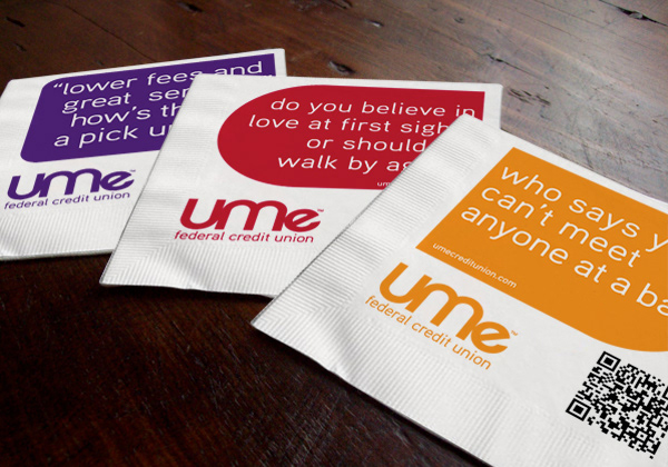
In branch graphics

Cross promotion collateral
Bus Shelter Advertising