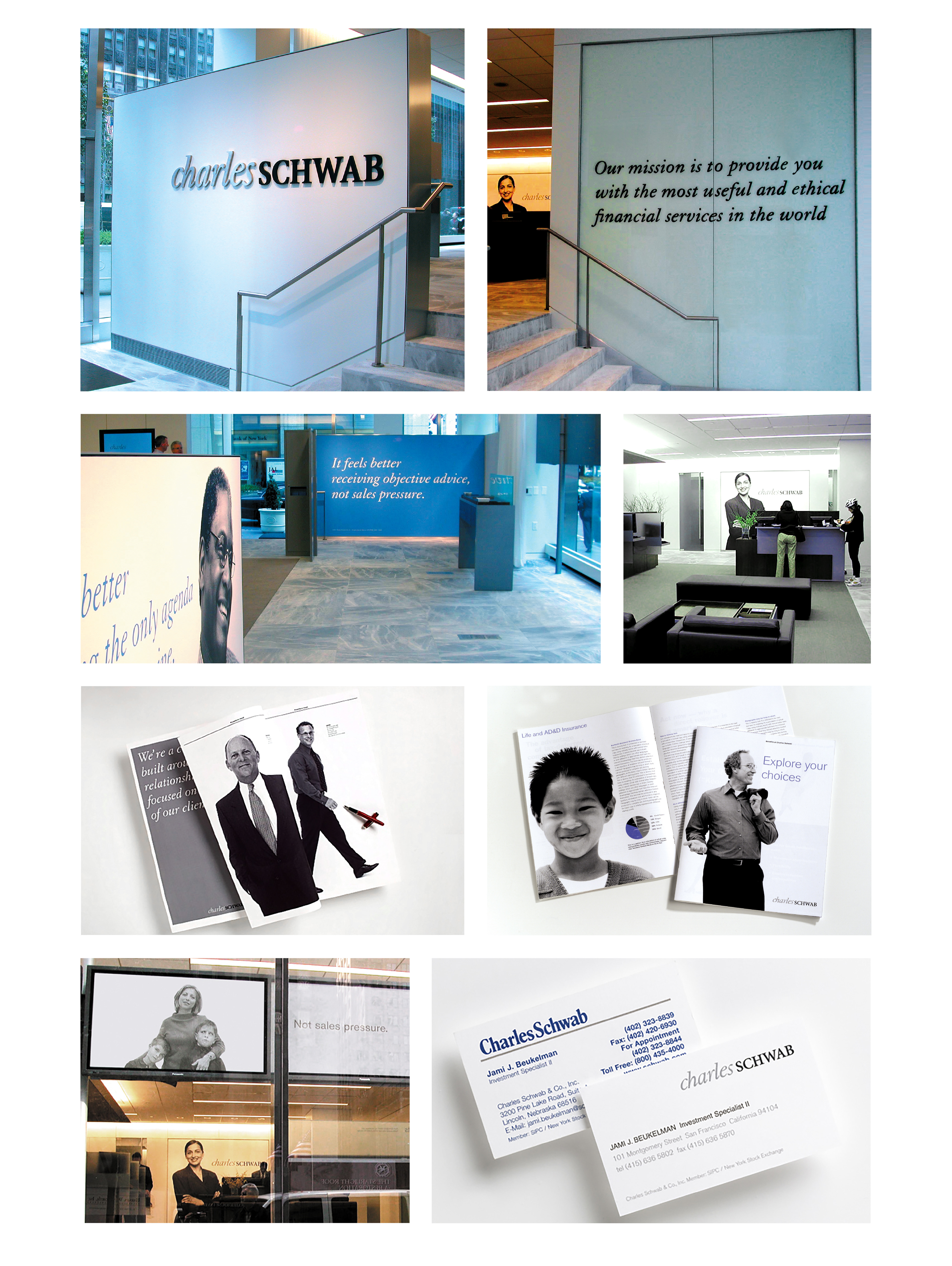
As the original self-serve financial market company, Schwab's original identity had been around since the 70's. Following a strategy that emphasized the personal, the logo is a combination of a more casual Charles, married with a more formal Schwab. The lower case letters symbolize the personal, the uppercase letters symbolize the solid financial institution. A month of shooting created a library of imagery to launch the new identity with. I oversaw this work for the Corporate Identity Group at Landor Associates.